Strategy, promotion, & booth design for a farm-fresh event
From the beginning, Associates in Family Medicine has been committed to helping individual patients while also fostering healthy communities. That’s why this Northern-Colorado-grown, fast-expanding family practice stays firmly rooted in all things local—from community service organizations and active living programs to creative opportunities for food and fun.
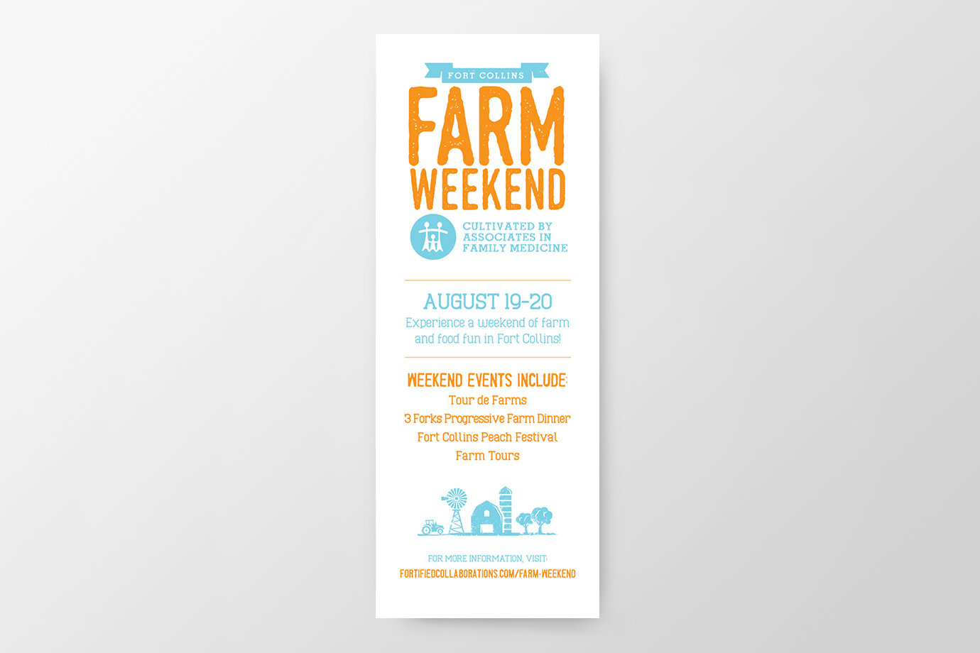
To reinforce AFM’s active and vibrant role in the Northern Colorado community, the Bonfire Effect team identified a way for them to “cultivate” support for local farmers, fresh, savory foods, and good causes throughout Fort Collins—all by sponsoring the first-ever Farm Weekend event.
Bonfire Effect worked with Fortified Collaborations to secure AFM’s sponsorship of the weekend’s various farm and food festivities, which included a farm open house, the Tour de Farms bike ride, the 3 Forks Progressive Farm Dinner, and the Fort Collins Peach Festival.
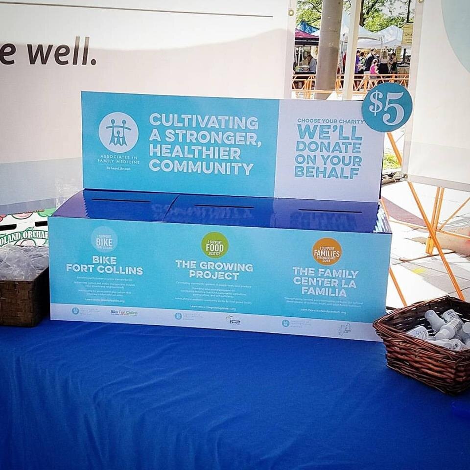
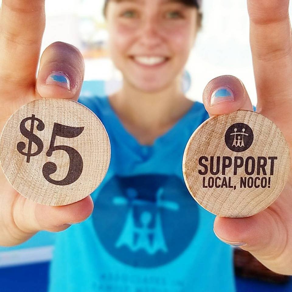
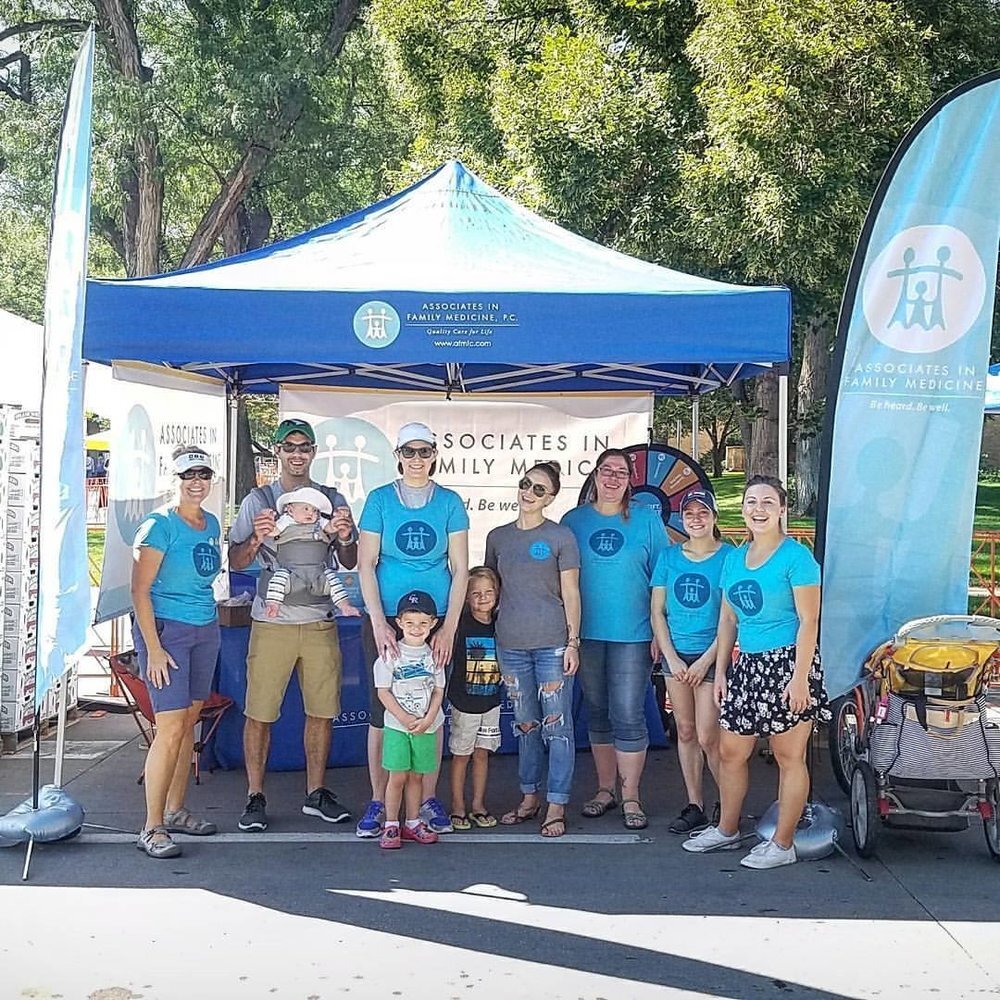
Our gang then completed engaging design and messaging concepts to promote the 2017 Farm Weekend and to build a distinctive booth experience for AFM at the Peach Festival. We used social media and local print advertising to spread the word and build excitement around the event. And to uphold AFM’s philosophy on giving back, we created a fun way for Peach Festival participants to pay it forward. As part of the “Win a Prize, Give a Prize” campaign, booth visitors had the chance to spin the Wheel o’ Health and land fabulous prizes. And for every person who stopped by, AFM made a donation on their behalf to support a local charity.
When everything was said and done, the 2017 Farm Weekend cultivated by AFM was a tremendous success. AFM was able to generate substantial awareness around their community-centered mentality while also donating $3,150 to three fantastic charities that all contribute to a stronger, healthier Northern Colorado: Bike Fort Collins, The Growing Project, and The Family Center La Familia.