We helped build a brand identity for the largest division within Brother USA through a cohesive set of standards and positioning that honors the Brother legacy and unites business units across the globe.
SERVICES
Market, Audience, & Rival Research
Brand & Product Architecture
Brand Positioning & Messaging
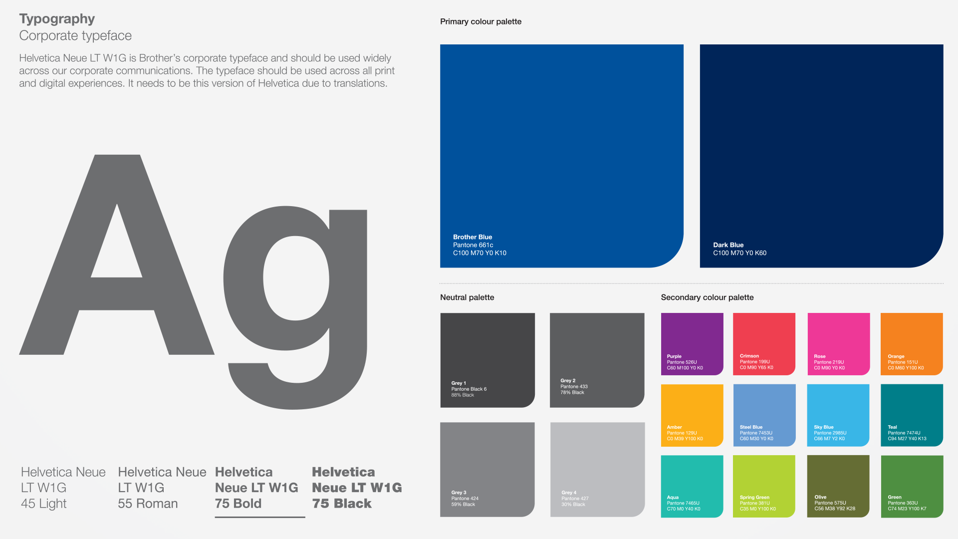
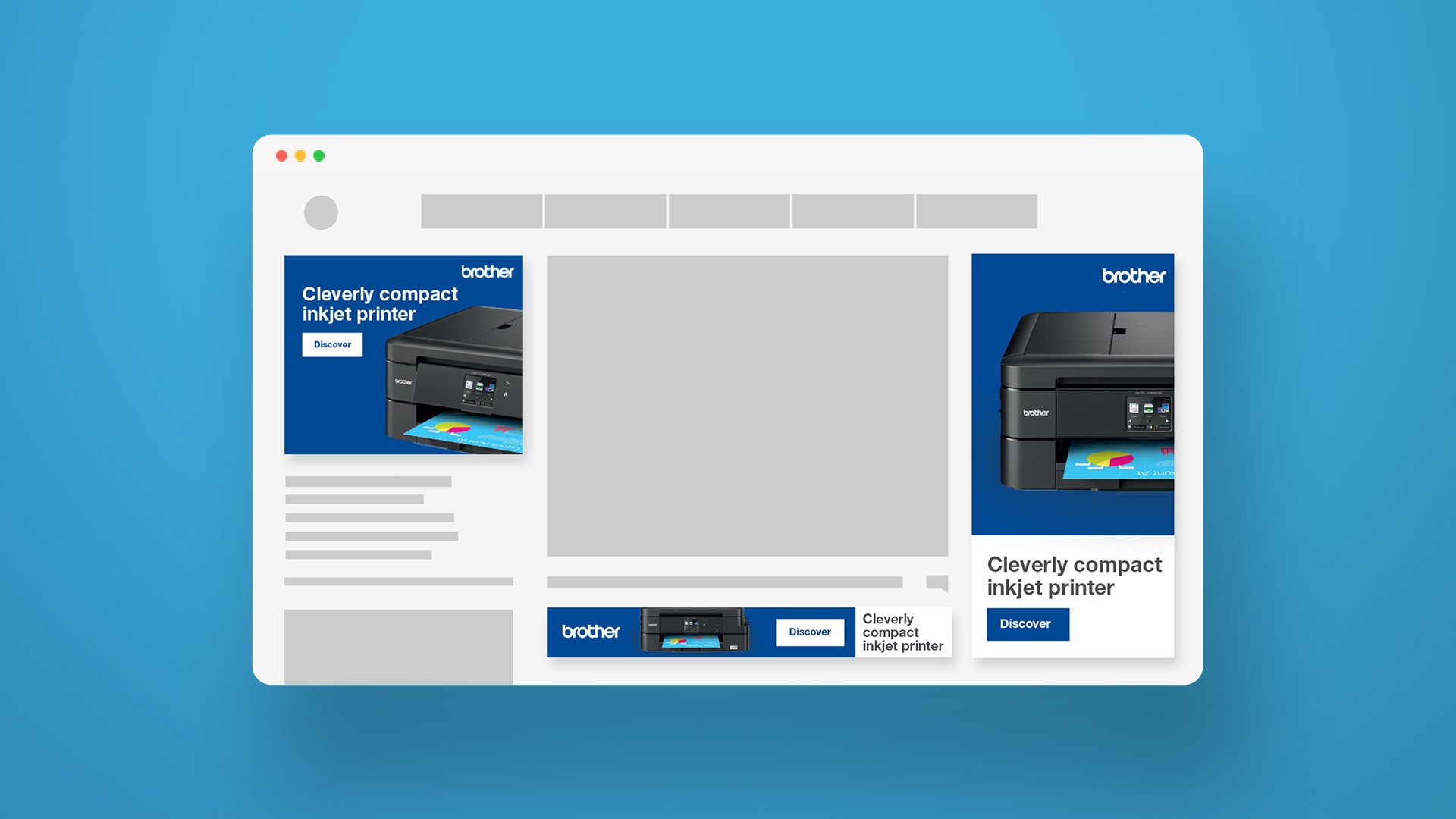
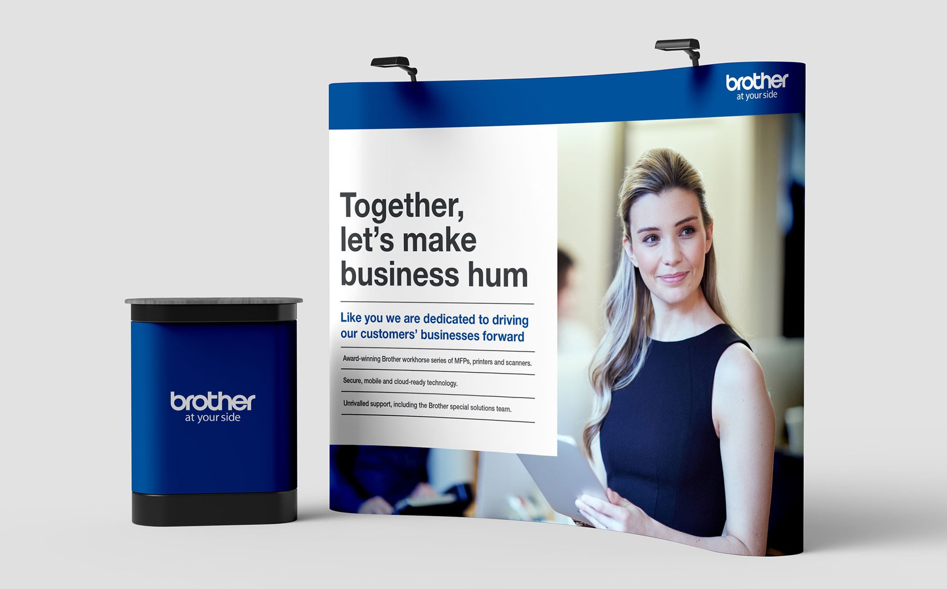
Visual Identity System
Website UI
Brand Guidelines Website
Challenge
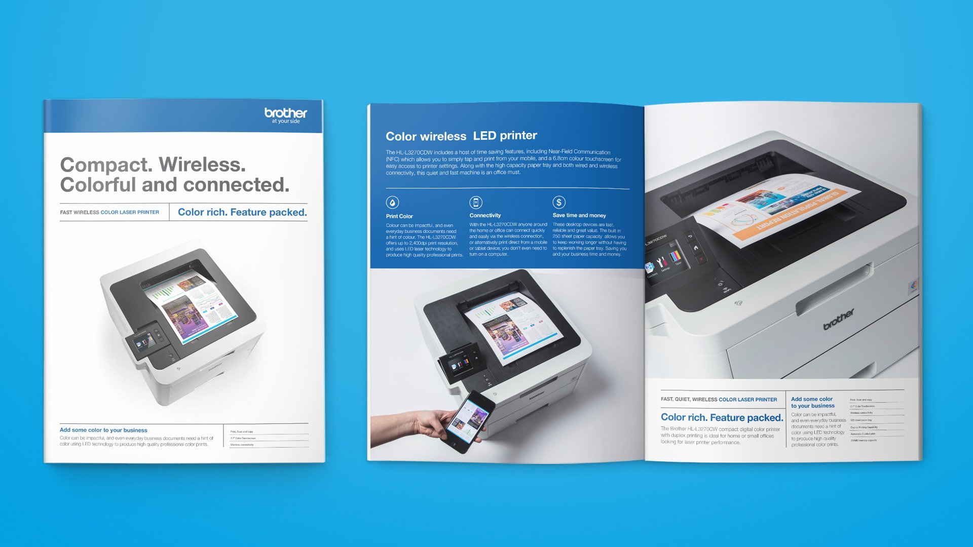
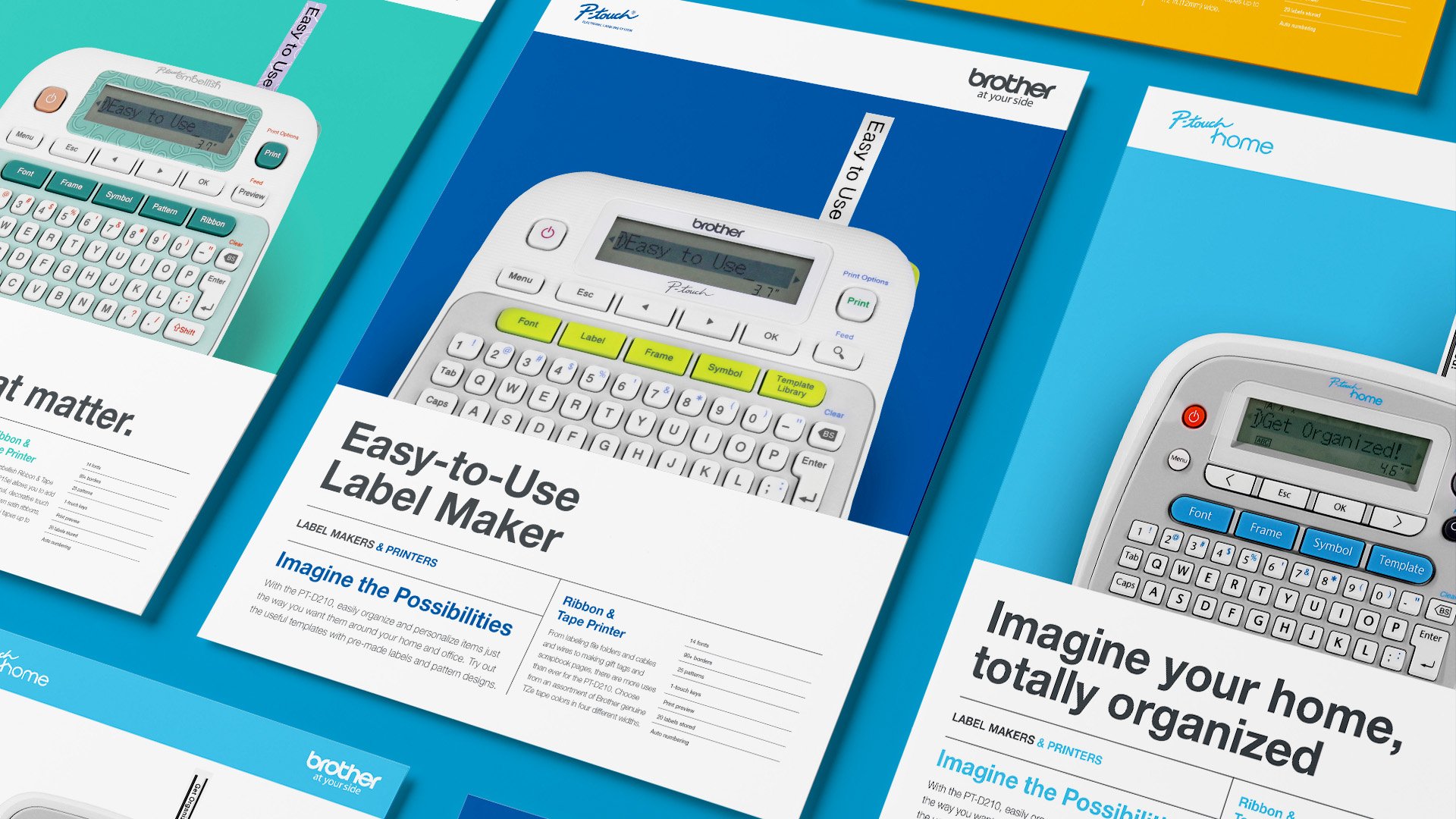
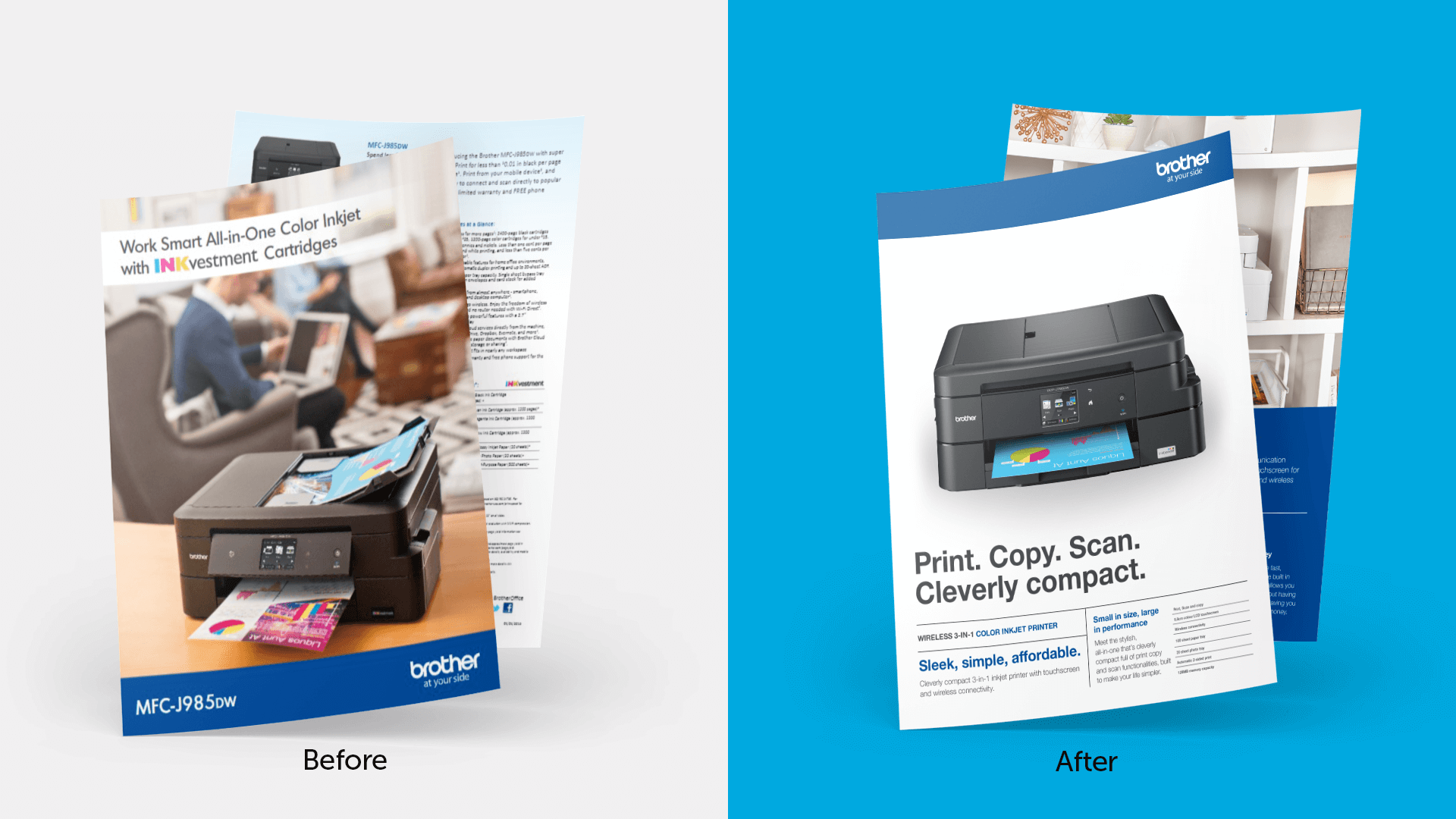
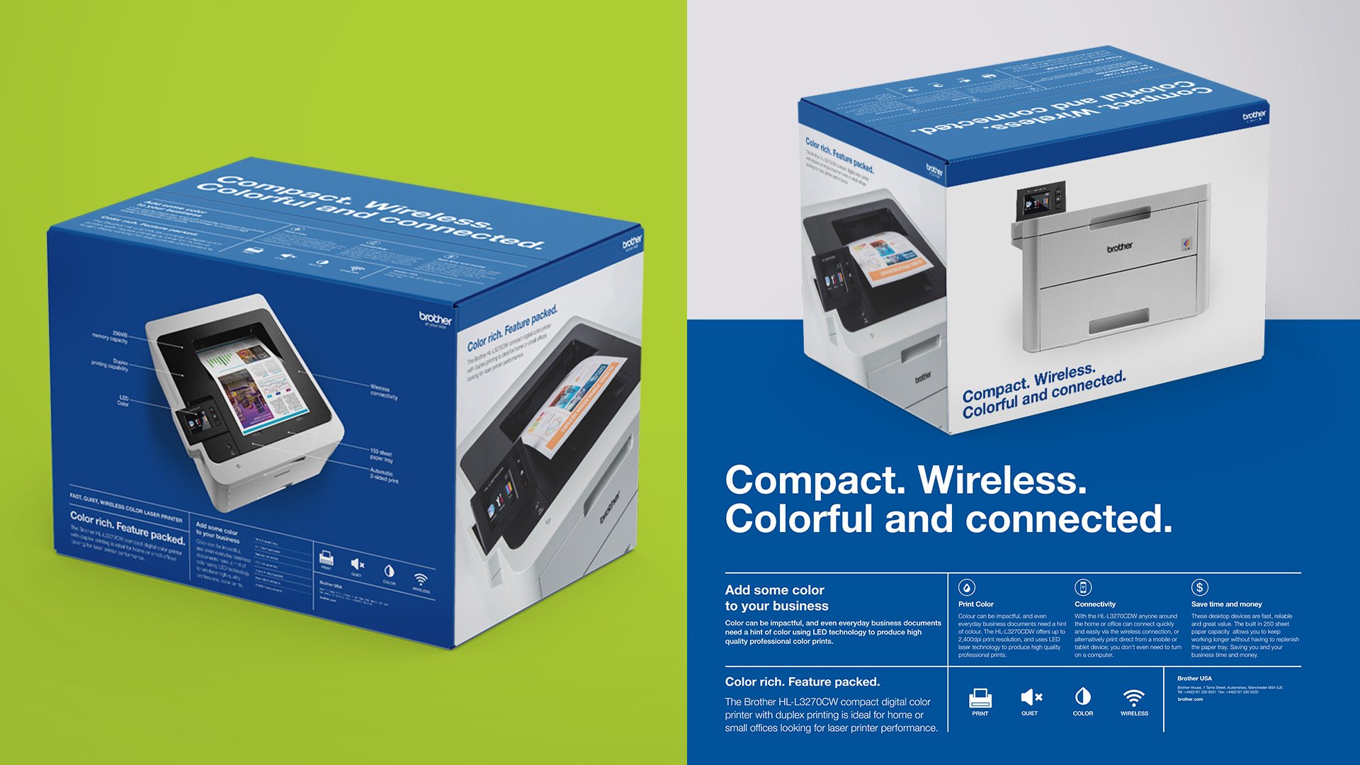
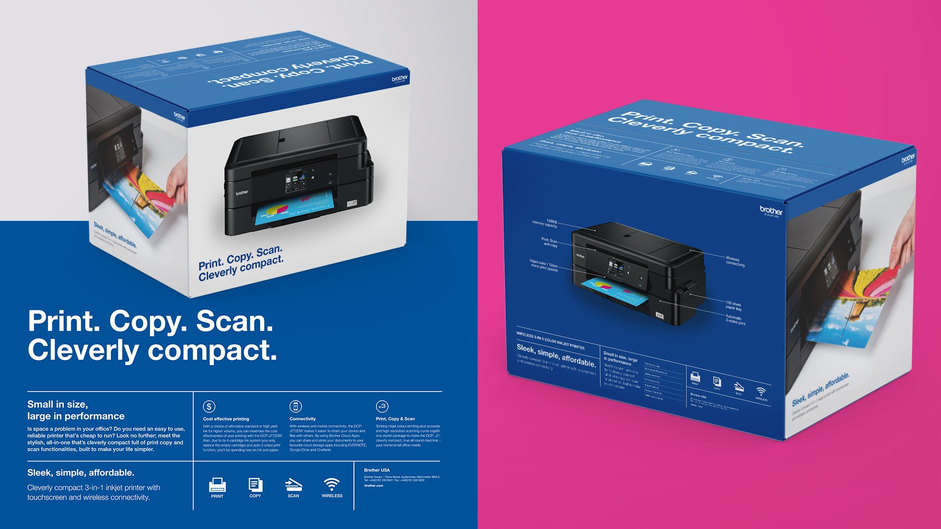
The commercial printing division is the largest division of Brother USA, and an industry-leader in multiple printer segments. With more than 100 years of product manufacturing, the Brother brand developed across different regions and departments. This organic evolution lacked unified guidelines, and Brother realized they needed to reset their visual brand. They sought a strategic overhaul, creating a comprehensive brand standards guide. The goal: revitalizing the brand while ensuring a cohesive direction for the future.
Solution
The Brother team knew their why. To create quality products, to provide lifetime support, and to bring together people and technology.
This is the kind of mission that we can get behind. And we did. Bonfire Effect went to work with the commercial printing brand team, reassessing and reaffirming the brand’s market proposition and identity. We examined foundational strategy elements—mission, motto, voice / tone, messaging—as well as the detailed inner-workings of visual identity—logo, color palette, typography, photography style. We kept what was effective and reimagined what was lacking effectiveness.
At the end of this process, we had completed a web-based brand standards guide. Now, this cohesive brand roadmap is at the side of the commercial printing team, offering an always-up-to-date and user-friendly resource for ensuring a consistent brand experience.
The effect
Brother initially requested a brand standards guide for a specific division. But the project’s scope evolved through our discovery and research efforts. The trust we established with the client through this process allowed us to take on a more complex challenge. Which gave us the opportunity to spark something bigger, bolder, and more effective.
The process of refining and revitalizing the brand led to clear messaging and design guidelines. This approach clarified marketing strategies, revitalized the Brother brand presence, and forged a stronger connection with global audiences.