Emerging from the Interwebs with practical (and affordable) ideas for your booth design can feel like an impossible task.
But chin up! We’ve gathered pro tips, tricks, and inspiration around trade show booth designs for the upcoming season. So whether it’s for an internal sales conference, small-scale regional networking event, or international trade show exhibit that demands big, bold brand displays, you can get real ideas for effective booth designs. Ones that fit your purpose and your budget.
1. Brother USA – Gone Squatchin’ at Nrf 2023: Retail’s Big Show
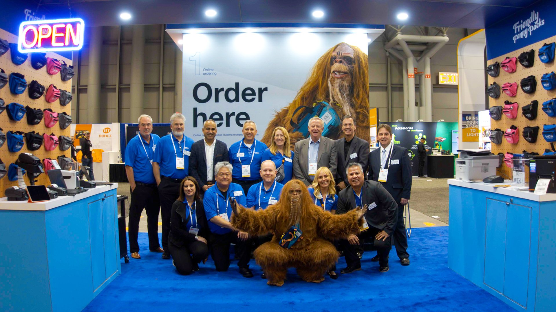
Brother USA went into NRF 2023: Retail’s Big Show with the goal to make as big of a disruption as their larger competitors. They wanted to showcase how four of their unique printer divisions unite to form “one Brother”—a cohesive set of solutions that address the numerous pain points and challenges inherent in the retail space. To demonstrate how the Brother USA line of printers, labelers, and sewing machines help move more inventory faster, Bonfire Effect created a fake brand with real merchandise: Friendly Fanny Packs.
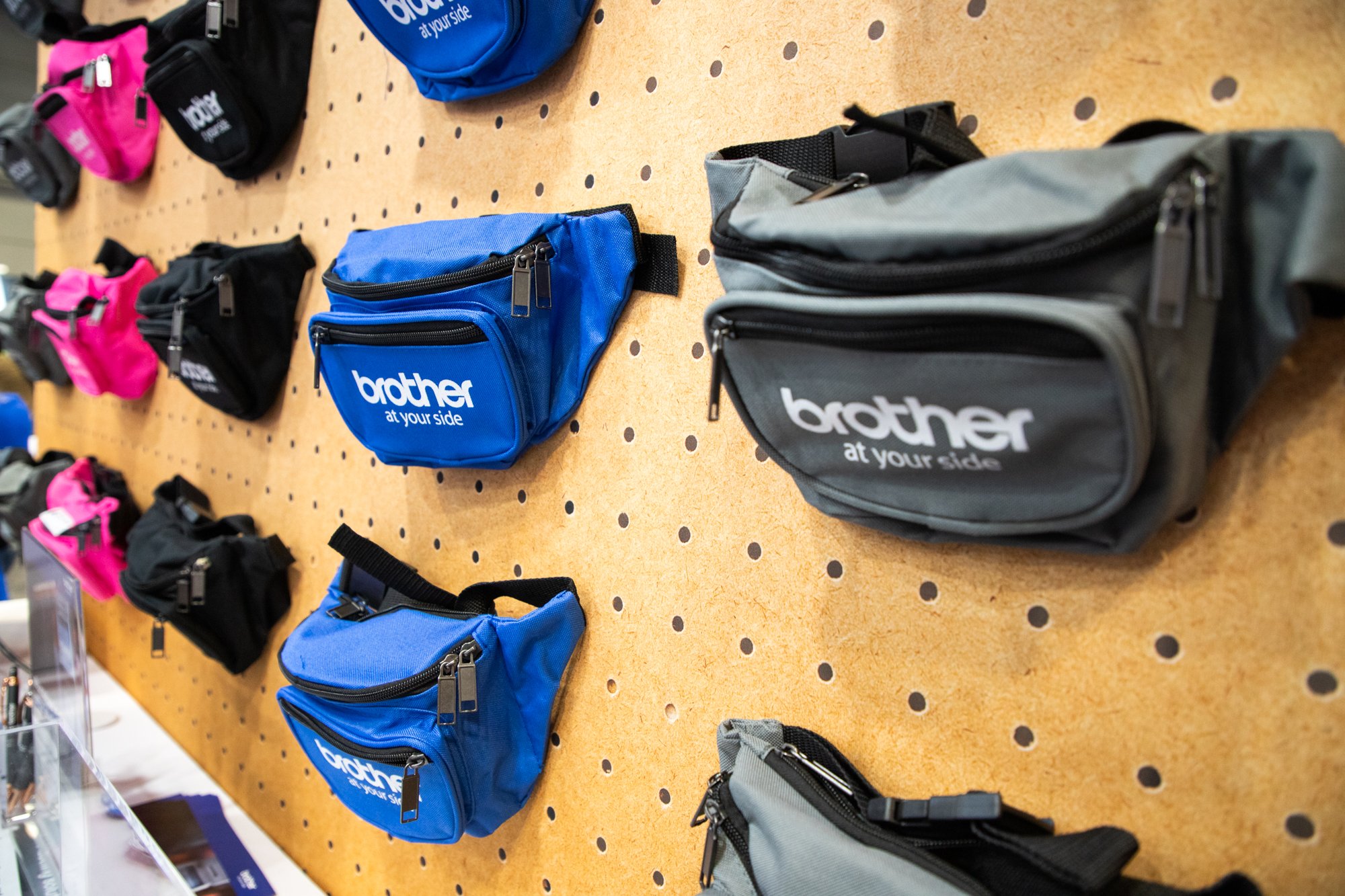
Why we love it: Visitors to the booth could pick a pack and follow along as it hit every point in retail journey—from dock, to stock, to sell, and every point in between. At each step, Brother team members put their unique printing solutions to work, giving live product demos within the retail context.
Oh, and the Sasquatch? We navigated around talent and diversity considerations by dressing up one of our own team members as the Sasquatch. Attendees stopped for selfies to prove that Sasquatch—and end-to-end printing solutions for any retail solution—does exist.
Pro tip: Think outside the box and don’t let budget be a barrier. Sasquatch was a low-cost but effective booth driver. The real draw was a real product with a real user experience. To drive engagement and attraction, don’t limit yourself to only what you can see. But what you can believe.
2. Commercetools – A Big-Time Booth Made for Innovative Interaction
Designed by Bonfire Effect
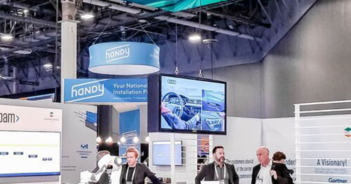
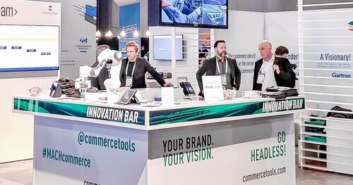
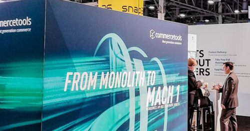
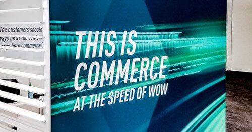
Why we love it: The open, airy design allowed Shoptalk attendees to come in from all angles. And once inside the booth, a range of interactive possibilities awaited them – from an IoT robotic bartender cranking out caffeine-rich “MACHtails” at the sound of a voice, to experiential VR demonstrating how partners work with the commercetools platform.
Pro tip: Invite your customers to be part of the experience by incorporating their stories into your booth display. It establishes better source credibility. And if you’re savvy, you may even be able to convince them to foot some of the booth bill.
3. Accurence – A Multipurpose Booth Exhibit to Express a Core Message
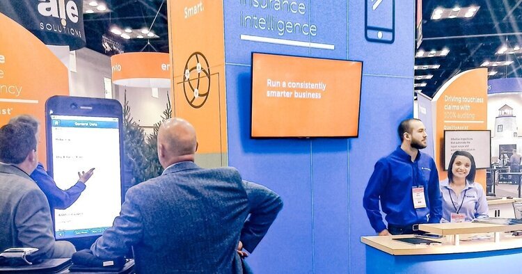
Sometimes your booth needs to live out a campaign theme and build excitement around a specific initiative. Other times, it needs to be a beacon for your larger brand. For Accurence – a leader in property claim software – the best solution was an evergreen booth design to serve as the first expression of their new visual identity while continuing to work across multiple tradeshows and events around the country.
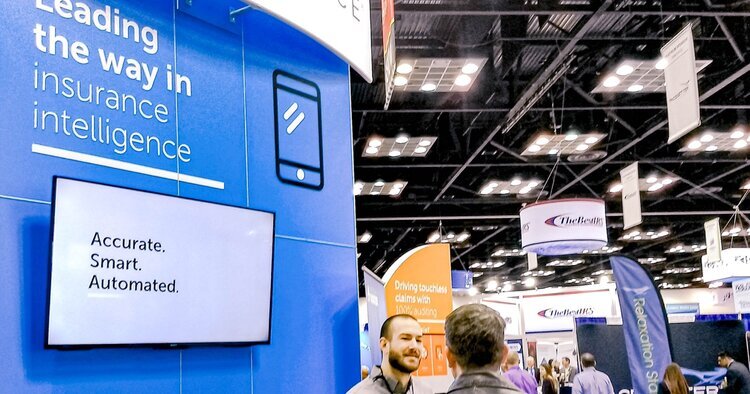
Why we love it: The simplicity of the message and the design on the Accurence booth acknowledges that tradeshow attendees are busy and you only have a split second to capture their attention. Using simple iconography for complex ideas, minimizing copy to short, punchy statements, and repeating that message often are all great ways to get the right point across right away.
Pro tip: Consider entrance angles when writing and designing your booth graphics. Remember, people aren’t reading your entire booth all at once. It’s perfectly fine to establish a simple, core message and repeat it on multiple panels.
4. Class Valuation – A Cost-Saving Booth Design With Big Impact
Designed by Bonfire Effect
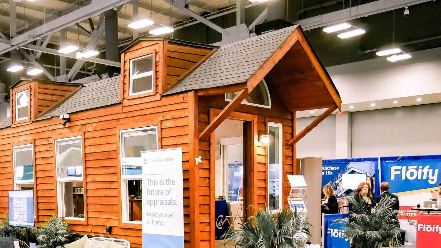
As they geared up for the annual MBA Expo (one of the largest gatherings in the mortgage industry), Class Valuation faced the age-old question of tradeshow decisions: to have a booth or not to have a booth? After all, paying $60K for the space plus $50K+ for booth production would cost a pretty penny, to say the least. So we got creative. Instead of a traditional booth, we opted to demonstrate Class Valuation’s 3D home scanning technology in a tiny home. Not only did this help minimize booth hardware costs and free up budget for a larger space, it also leveraged an unconventional design that stood out in a tradeshow floor of sameness – literally making tradeshow attendees feel “at home.”
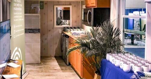
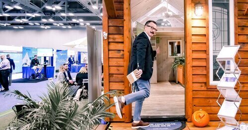
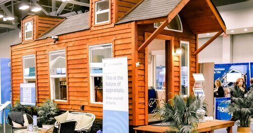
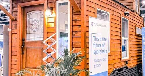
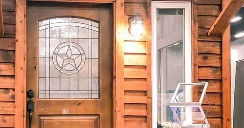
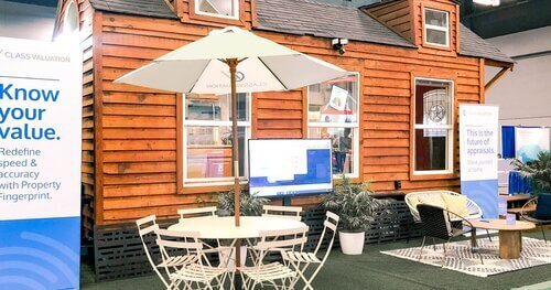
Why we love it: Letting your booth become something unexpected while also living out a core component of your brand can be a genius marketing power move (it can also add complexity… don’t miss this word of caution below). At MBA Annual19, Class Valuation’s tiny home display lived out their brand in a very tangible way – with an overt nod to the housing and lending market space that also took people by surprise.
Pro tip: When you work with a professional booth manufacturing partner, you pay for assurance. When you decide to go outside the box with your display, there are often uncertainties. (Like the 10-tiny-home-partnerships-that-fell-through-leading-up-to-your-event kind of uncertainties.) The impact could be well worth it. But be ready for complexity.
5. Hach Company – Thematic Booth Design on a Dime
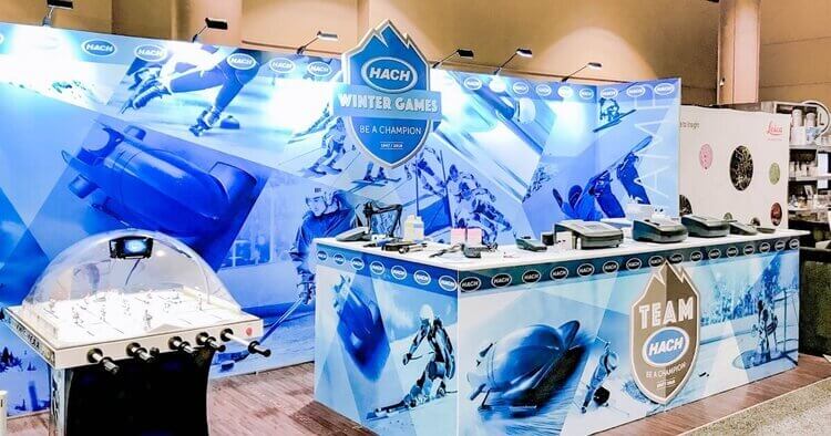
Normally, Hach Company sticks closely to their core brand when it comes to their bigger booth displays. But for a more casual annual sales conference amidst a good number of familiar faces, Hach takes the opportunity to loosen the tie on their brand – with fun, thematic booth displays that express the brand in an all-new way.
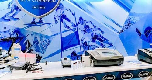
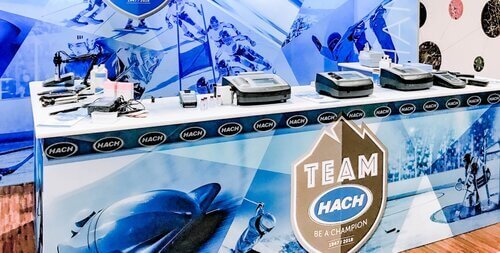
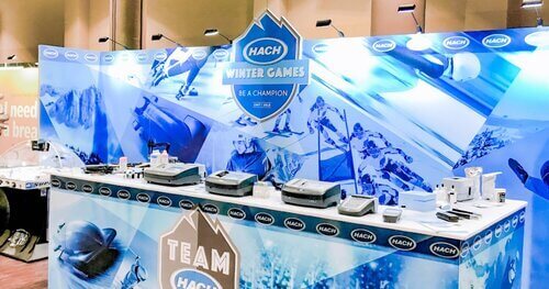
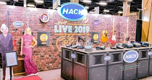
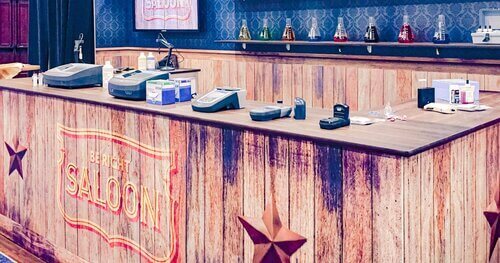
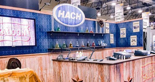
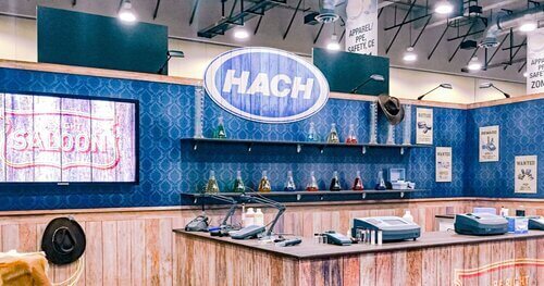
Why we love it: Over the years, Hach has been able to leverage their thematic displays at this annual sales event to effectively convey their company culture and leave memorable impressions. And by creating thematic giveaways and clever traffic-building activities, Hach is able to maximize interactions and reinforce relationships.
Pro tip: Align the activity at the exhibit space with your creative theme to drive home your message and get people involved. For Hach, that meant gold medal giveaways for standout clients at an Olympic-themed booth one year. Another year, it was a red carpet selfie station with life-size cardboard cutouts of Brad Paisley and Carey Underwood – all within a booth themed after a Nashville-based recording studio.
6. VT Miltope – Brand Consistency Meets Flexibility
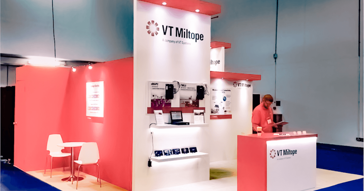
As a leading supplier of rugged computers and systems for military, industrial, and commercial aviation applications, VT Miltope exhibits at shows and conferences around the world. While the company owns their domestic booth, they rent exhibit assets for one-time usage at international events.
Why we love it: When your booth display covers a lot of ground at events around the globe, things like budget, changing floor plans, and cultural considerations all come into play. That’s when choosing to rent your exhibit components like VT Miltope can be the smartest move. By renting your booth assets, you can stay flexible when attending multiple shows (even on a tight budget). This approach also enables strategic brand consistency while staying mindful of local cultures and varying floor plans.
7. Arrow Electronics – A 25x40 Exhibit to Show a Complete Brand Story
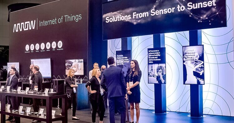
In attending Mobile World Congress Americas, Arrow Electronics wanted to convey their complete IoT Story – showcasing technology solutions that improve business and daily life. Their towering exhibit in an expansive space left no doubt as to the location and identity of the industry’s dominant player.
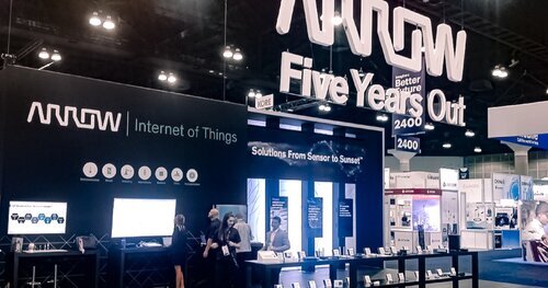
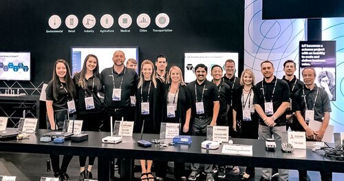
Why we love it: Actions speak louder than words. Or so the saying goes. And when it comes to effective booth exhibits, the tried and true phrase rings true. Working with a huge space at one of the industry’s biggest shows of the year, Arrow and Skyline didn’t just fill the floor with swanky visuals and captivating copy (though backlighting, custom flooring, and motion graphics certainly didn’t hurt). Instead, they focused most of their attention on interactive demos – divided clearly into key vertical segments across a custom 20-foot front counter. This approach allowed them to show their brand story in action, not just in print.
