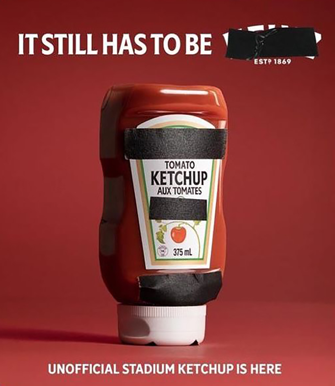
When FIFA required non-sponsor branding to be covered during the 2026 World Cup, Levi’s turned the restriction into a viral branding moment. The incident showcased the power of strong brand equity and offered a lesson in how recognizable, well-established brands can stand out—even when their logos are hidden.
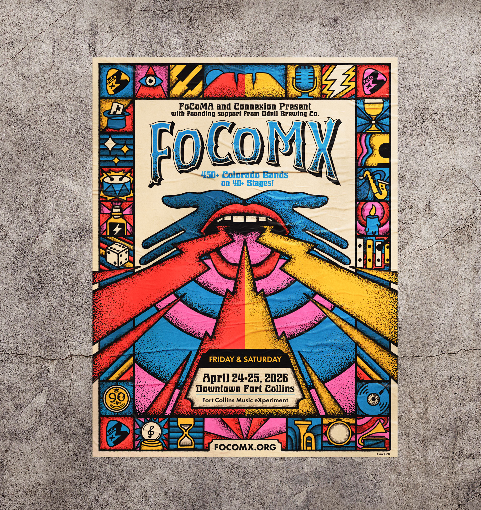
Explore how Bonfire Effect built a bold brand system for FoCoMX 2026—turning a music festival into a magical, community-driven experience.
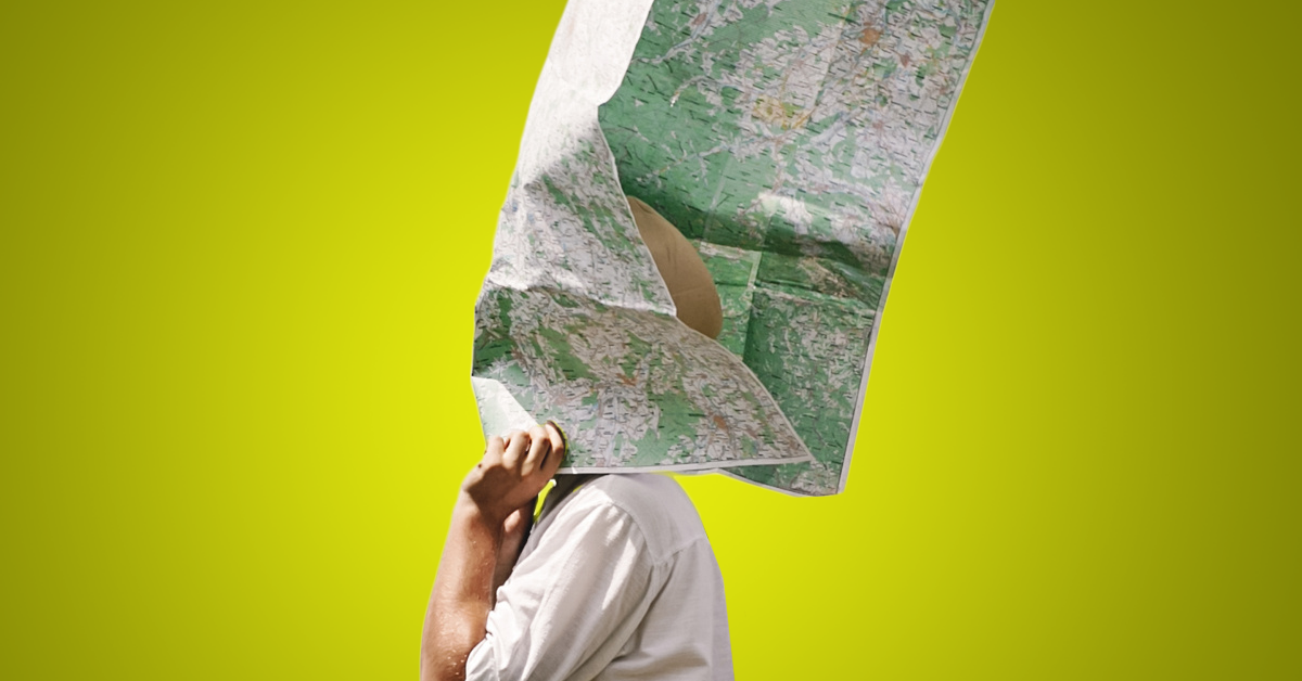
Traditional partner portals fall short. Learn how intelligent partner ecosystems use experience, data, and AI to drive measurable channel growth.