First, the backstory
Novelty is the spice of life. But if you don’t go out of your way to find it, things can get a little stale. That’s why we started the Bonfire Sandbox. It’s a way for our creative team to create left-field projects, complete with eccentric imaginary clients and tricky design parameters. Every month or so, our creative team brainstorms a new challenge, made to push the limits of our idea development, problem solving, and technical design skills.
So how did we decide to start digging in to our proverbial Sandbox? The same way we start every single day… with coffee.
Grounded in creativity and fueled by bold ideas, our designers set out to brew up original packaging concepts and designs for an imaginary craft coffee roaster.
The gist of the project
Design packaging for an upscale, edgy coffee roaster called Opinion.
The real design challenge
Base the design around a repeat pattern.
The final results
What you’re really here for… the kick-ass designs. Plus some insights and inspiration from the designers themselves.
Drew Todd
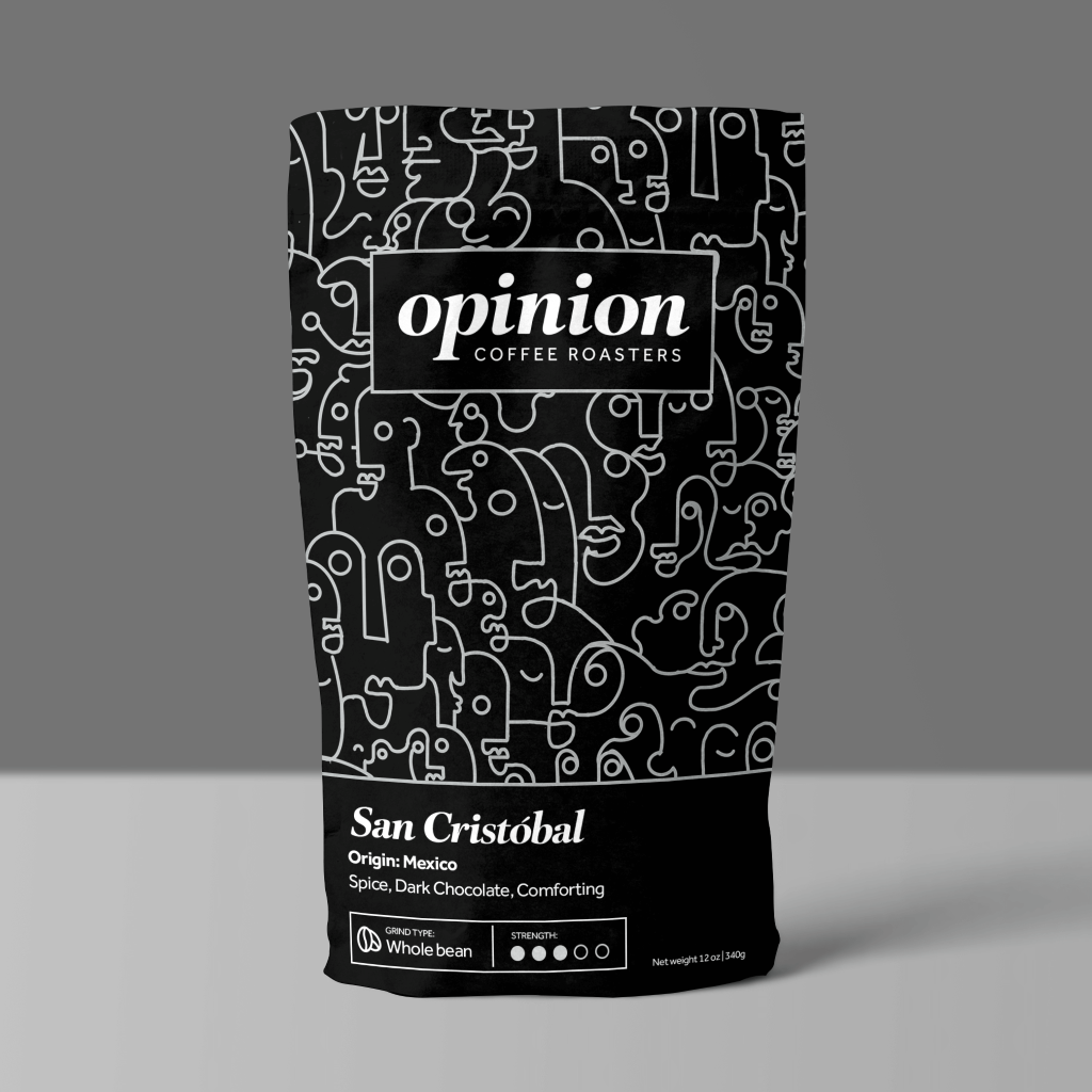
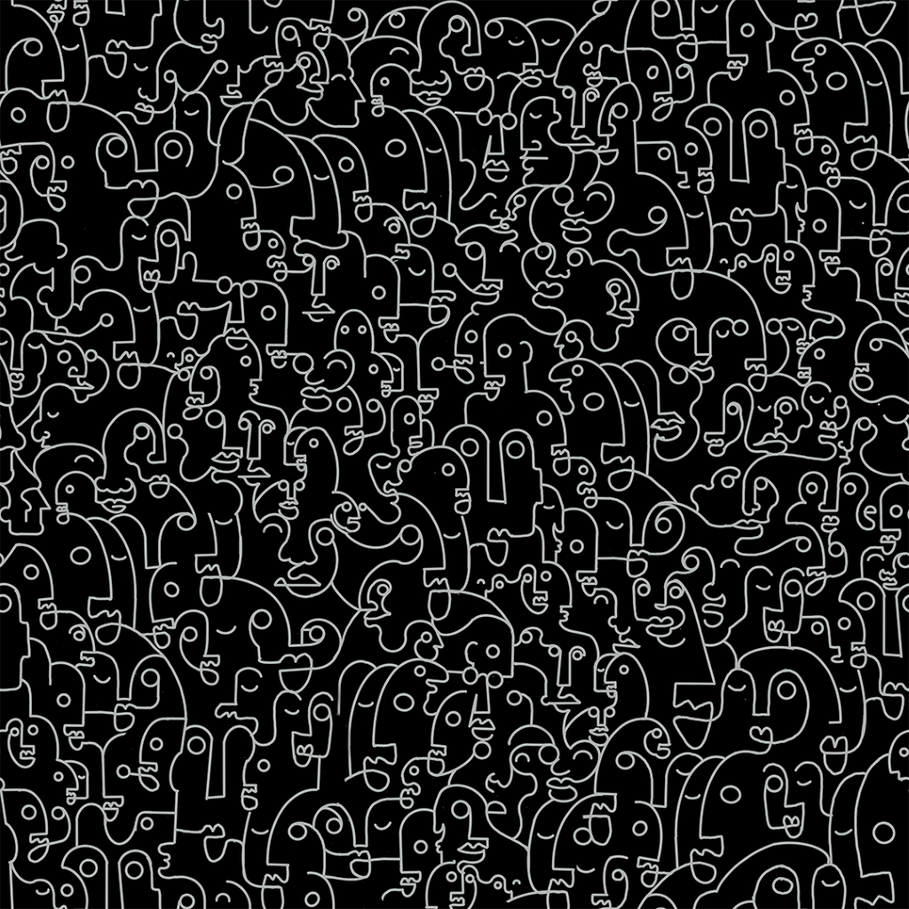
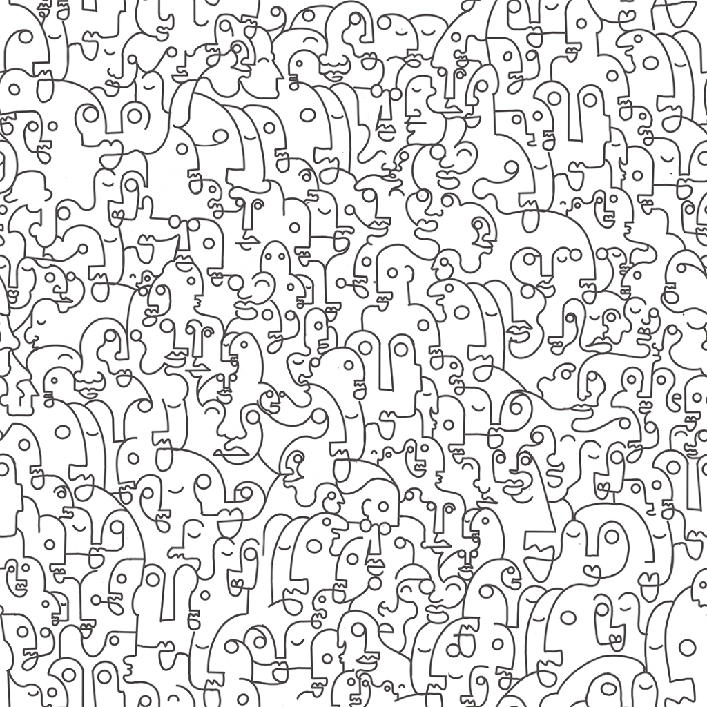
My vision of Opinion Coffee Roasters was to focus on all of the characters who come to coffee shops and capture the low murmur that always accompanies a good coffee shop. Opinions should be playful and fluid, so I based my pattern style on the kind of absentminded napkin doodle that people do when they drift off in thought. I wanted to have a very gestural feel but with repeat shapes and forms so that the pattern as a whole wouldn’t feel too out of control. The color scheme is classic, but it’s also a playful nod to the old “black-or-white fallacy” people often fall into when we have debates with each other.
Trais Barhaug
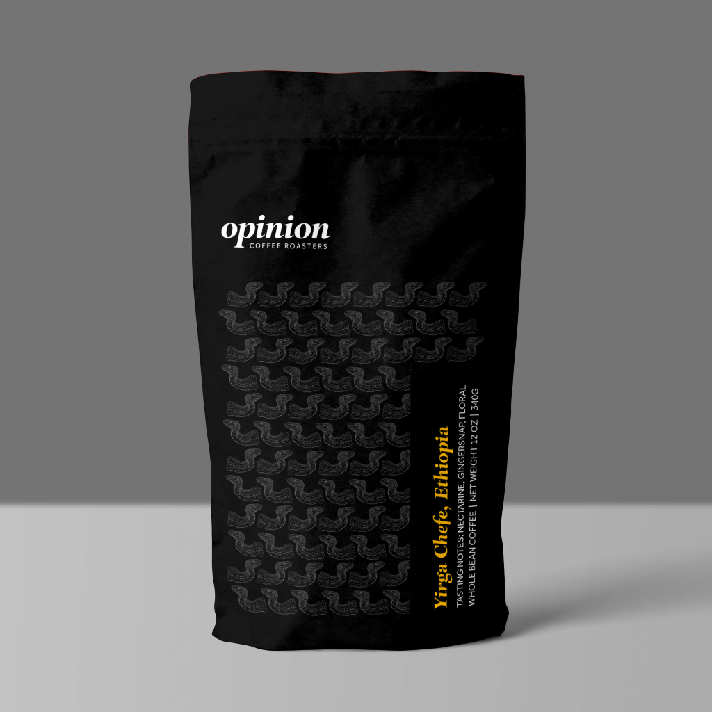
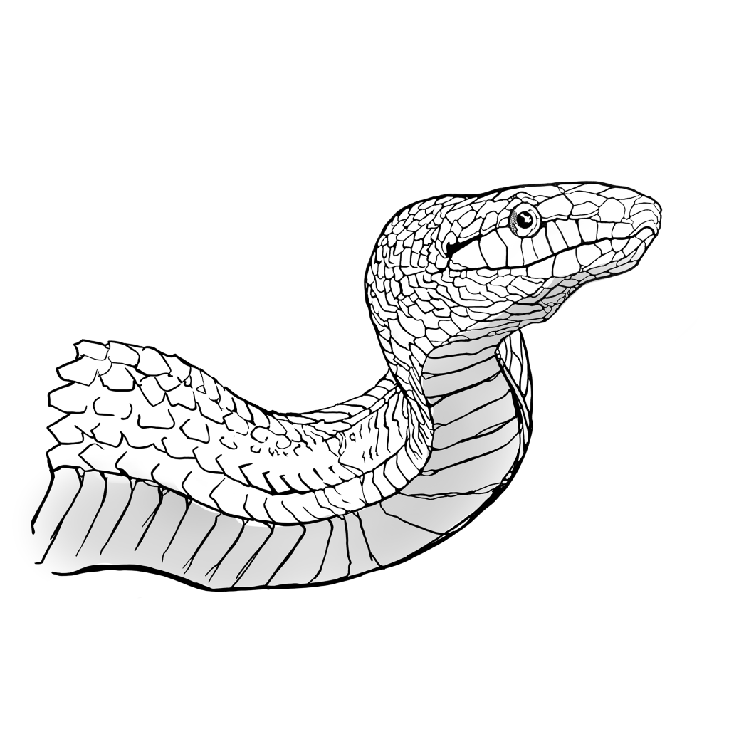
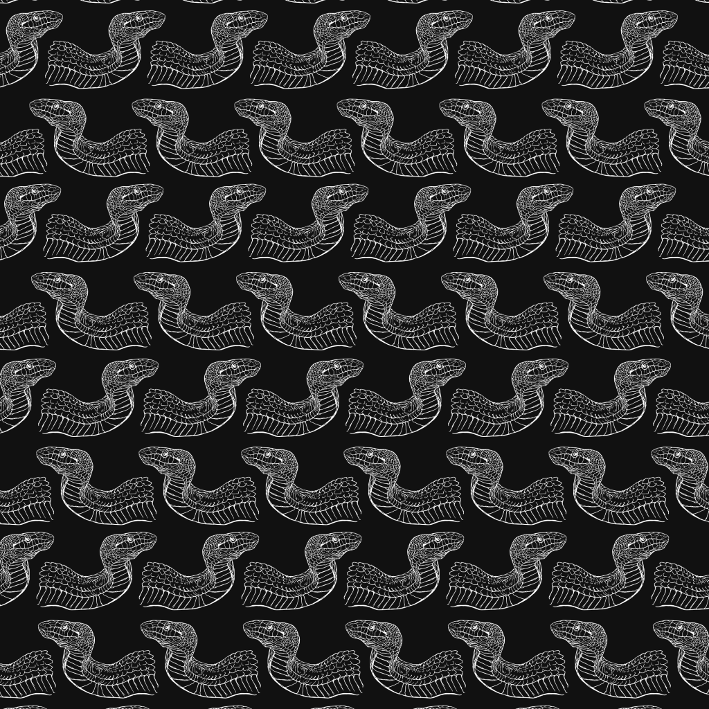
For this design exercise, we decided to design around a coffee roast from Ethiopia. I took an animal native to Ethiopia that I felt would embody the smooth, rich flavor of Opinion coffee. I chose the Ethiopian mountain viper, as I liked its shape. I used the snake to create an almost M.C. Escher style tessellation, using the curve of the snake’s form to create a negative space shape that would fit the body of the following row of snakes. I chose a dark color to allude to the coffee’s bold flavor. I wanted the shape of the snake’s body to feel similar to the strong curving lines of the typeface. I sketched out the snake, then created several patterns from my favorite snake in Illustrator. Since I find minimalism to be very effective when working with an “edgy, upscale” modern brand, I wanted to use minimal color. So I stuck with a three-tone pallet, using a soft black, a white, and a bold yellow for the callout.
Silas Nelson
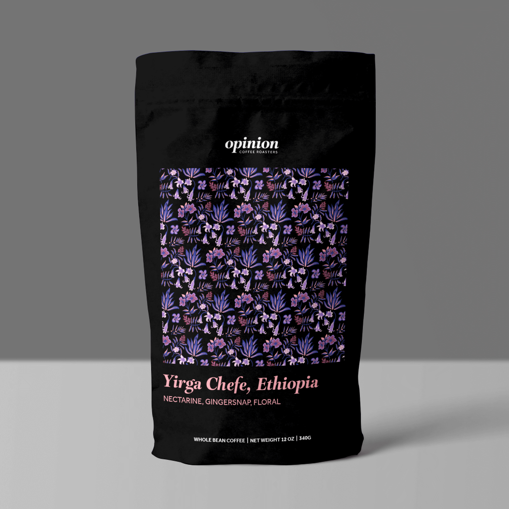
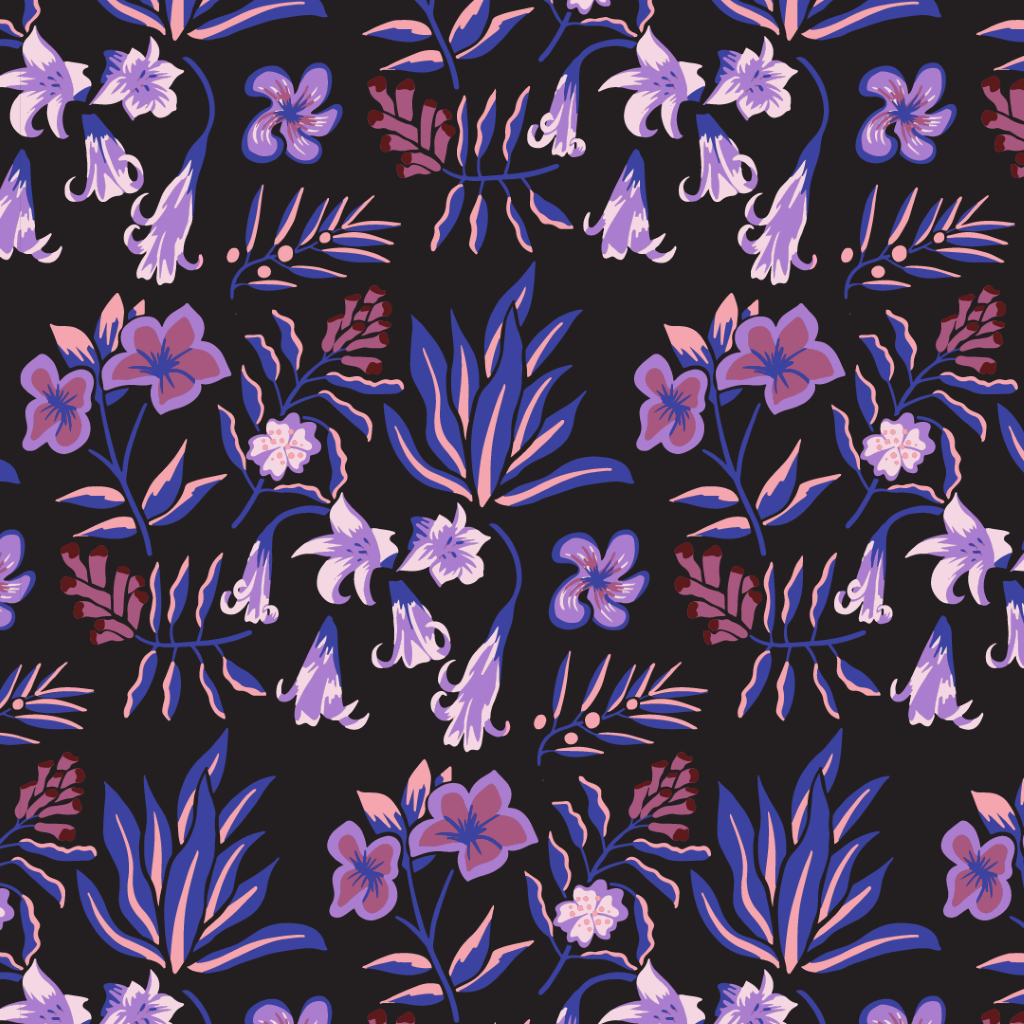
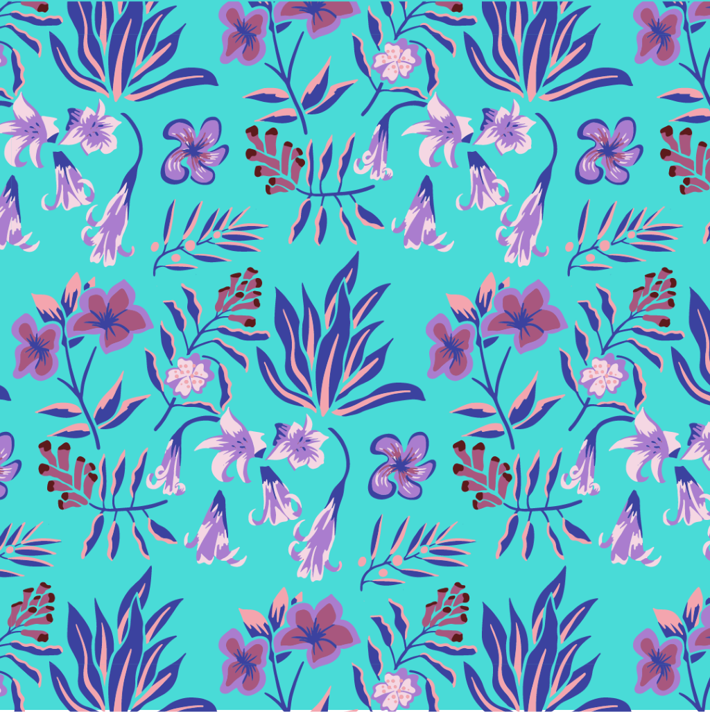
I took the opportunity with this challenge to design a plant-based pattern that’s been floating around in my head for the last few months (plus I’ve been eating a lot more plant-based food, so maybe that also influenced my decision). I researched plants that are common in Ethiopia (to go with the coffee beans’ place of origin that I chose) and began sketching out some stylized plants. I took my sketch into Procreate and rendered out the basic shapes, keeping the loose, hand-drawn feeling from the original sketch. From there, I vectorized the design in Illustrator to make the repeat pattern, refine the spacing between plants, and quickly experiment with some color schemes. I landed on a really lovely analogous purple color scheme that complements the flavor notes of this specific roast.
