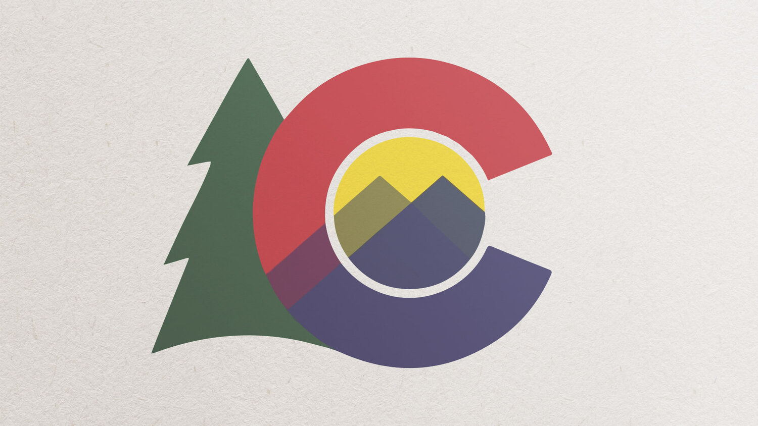
Colorado has a new logo. And it’s… something.
At a press conference yesterday, Colorado Governor Jared Polis – wearing a suit and a beanie (sure, why not) – revealed the new state logo. It’s got a tree! And the “C” from the state flag! And mountain gradients! And lots of colors, because… Colorado!
New logo for Colorado!
— Jared Polis (@jaredpolis) March 26, 2019
The tree evokes Colorado’s natural resources and spirit, red symbolizes Colorado’s red soil/rocks, yellow shows our sunshine and wheat of the plains, dual peaks represent the mountains in our state, blue base represents water-our most important resource pic.twitter.com/U0KzCh7cDd
According to Polis, the include-as-many-elements-as-possible dynamic of the new logo “better reflects our whole state” and “is consistent with our goal of having a Colorado for all.”
Polis was eager to point out that the new logo was designed internally at no cost, while the previous logo, commissioned by the Hickenlooper administration in 2013, cost $2.4 million and was professionally designed. But the governor also said the new logo will only replace the old logo on an as-needed basis to keep re-branding costs at a minimum.
Ah. The penny drops. What we have here is a state of brand confusion. There are a few problems that need to be addressed.
A Logo Is Not a Brand
First, there’s no such thing as free. And you get what you pay for. It seems that the Polis administration fell for one of the classic blunders: believing that a logo and a brand are synonymous. A logo is one piece of your bigger brand story. It shouldn’t, and can’t, successfully stand alone.
The $2.4 million Hickenlooper price tag didn’t only cover logo design. As the Colorado: It’s In Our Nature brand guidelines show, the tab seemingly went much further toward building a complete brand system. This document explains the brand’s core message and positioning, and how those things are supported through proper photography and logo-use. The brand color palette is extensively defined, whereas the new logo is a color palette. (Sorry.) There are clear examples of how the brand elements – logo, tagline, department shield lock-ups, etc. – all play together. There are also instructions on how to use the logo in black-and-white and reversed applications (more on this in a minute).
Maybe a brand guideline exists for the new logo. And even if you prefer the new logo to the old, a lot of thought and care went into developing a full-fledged brand for that green triangle.
Colorado for All?
Secondly, you can’t be everything to everyone. “A Colorado for all” is, in some ways, a Colorado for none. There’s a lot of power in being something to someone. Brands that earn loyalty are brands that enter into someone’s specific story, identify and empathize with that person’s problem, and work as a guide to help them on their journey.
Ironically, throwing the entire kitchen sink into a logo design in the name of “inclusivity” is self-defeating. As the great Judd Apatow once said, the more specific you are, the more universal you are. Meaning, if you actually want to appeal to the masses, cater to a specific audience and empower them build a movement.
About the Design…
Maybe you like this new logo. Maybe you prefer it over the previous one. Which is all fine. There is a subjective element to logo design (and art in general). But how well will a black-and-white version of this logo print? (I’m looking at you, gradient mountains.) How will this logo work on a black background? How will an all-white version of the logo be executed and used? Designing logos is hard, and the best logos are usually simple ones that clearly convey the essence of the brand in a variety of contexts.
So, just for fun, we decided to pay our designers zero dollars and gave them 30 minutes to come up with some alternative logo options. We even had them come up with slogans for their designs, which is typically not advisable.
Feast your eyes, Coloradans.
And a poster for good measure